March 11, 2026·Aesthetic Study
Frutiger Aero
Those Windows Vista water-drop gradients sold a friendly digital utopia we are still waiting on.
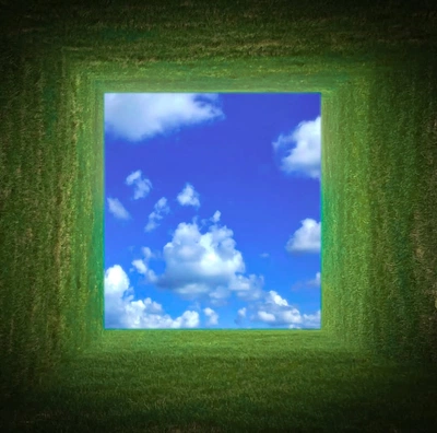
Frutiger Aero is more than retro-futurism. It was born in ordinary places — XP and Vista screens, airport kiosks, corporate sustainability decks. It’s sky-blue and leaf-green gradients, sun flares on water and glass, humanist sans-serifs floating over stock-photo nature and infrastructure. It signals: the network is benevolent, the planet is being handled, and the interface will guide you from one gate to the next.
We’re now living in the future those gradients advertised — total connectivity, a permanent state of “on” — but it feels heavy, not weightless. It reads like the ghost of a modernity we were promised but never quite received.
Frutiger Aero sits in that tension — too codified to feel new, too comforting to disappear — a visual optimism for a utopia we’re still waiting on.
- Read Dazed’s definitive Frutiger Aero explainer
- The Guardian traces the aesthetic through TikTok
- Meet the trend’s namesake, designer Adrian Frutiger
- Press the green button on the Frutiger Aero playlist
More from Sequence