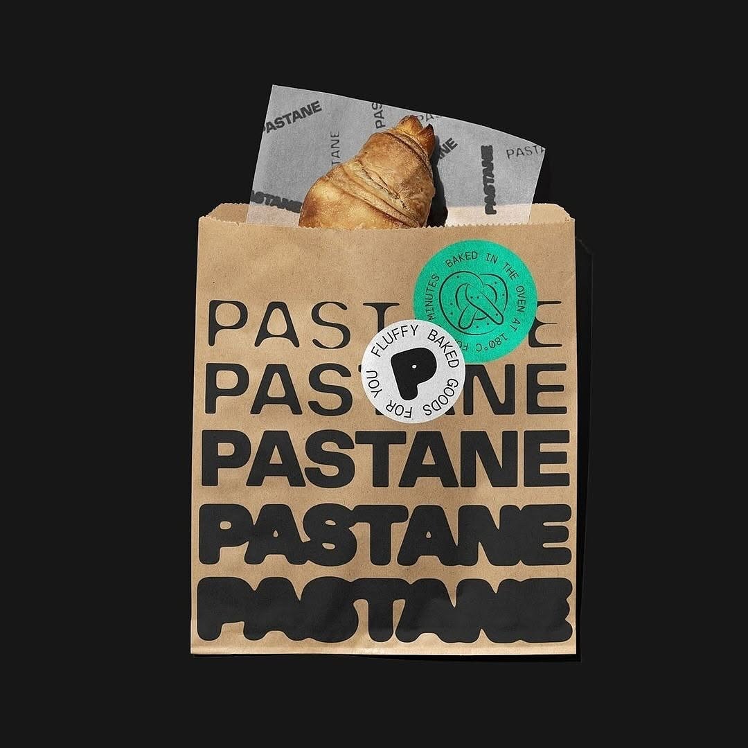

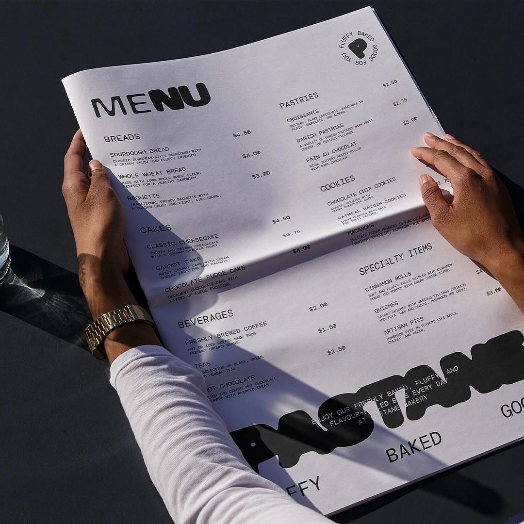
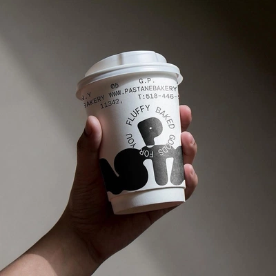

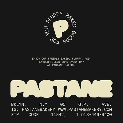
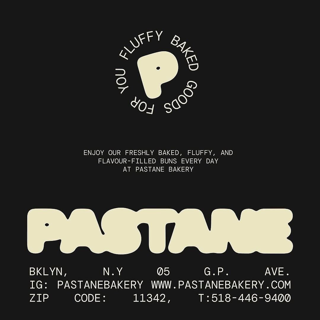
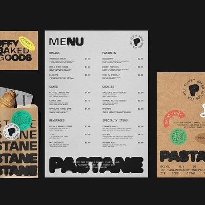

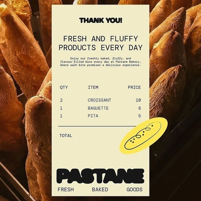
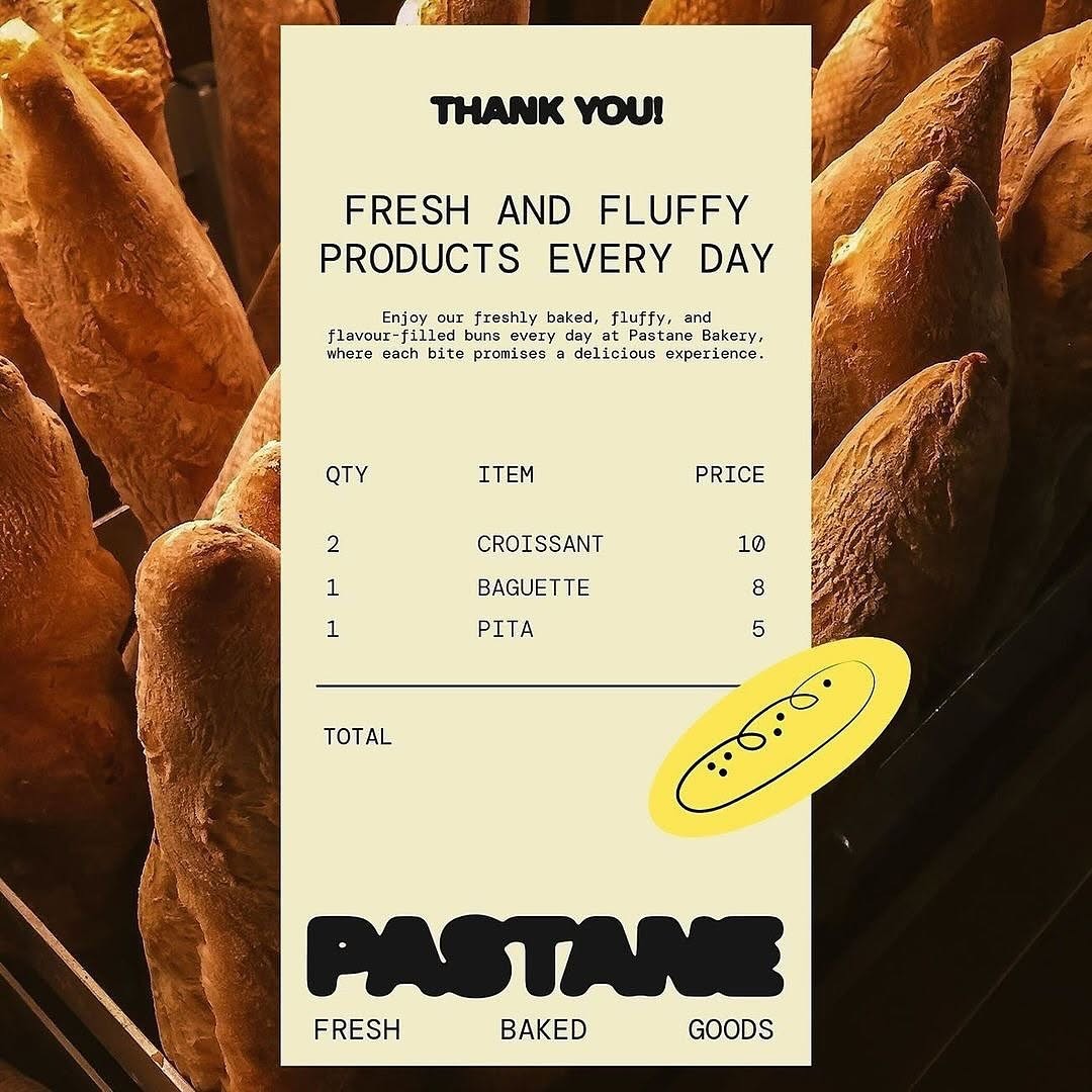


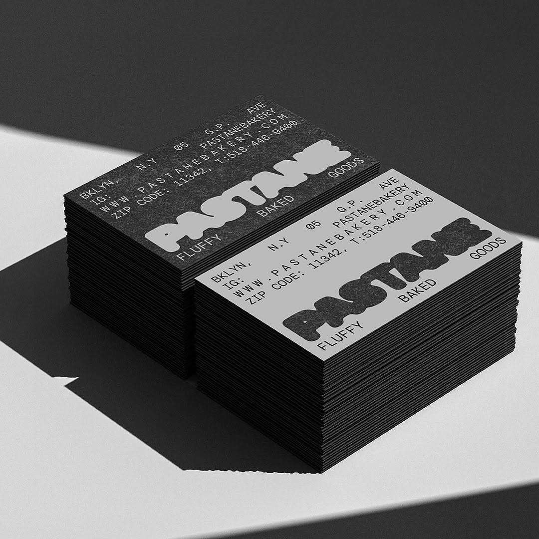
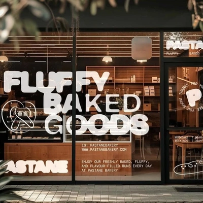
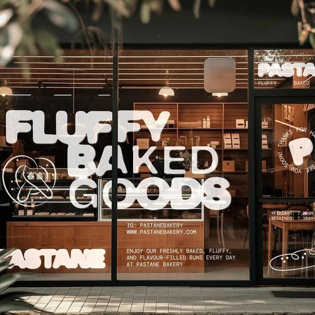


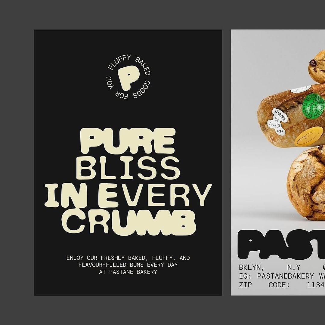
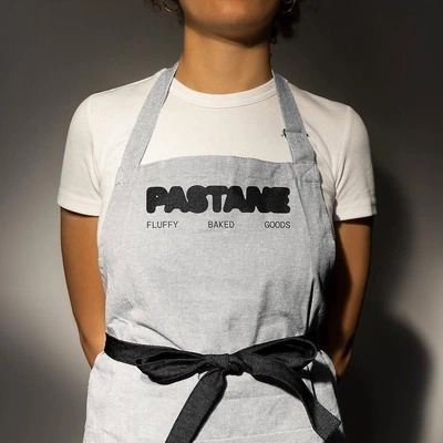
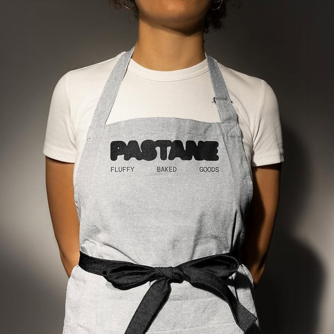
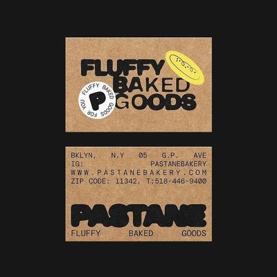

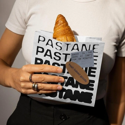

#PPFIU ––––––––––––––––––––––––– Creative: @mubarizyusifzade Client: PASTANE Font: PP Telegraf ––––––––––––––––––––––––– « I chose a simple concept: bread that rises as it bakes, and typography that evolves similarly. Just as some bakery products stay in the oven for varying durations, resulting in different textures, I applied this idea to typography. This led to the creation of “underdone” and “well-done” fonts, representing different stages of baking. This project seamlessly integrates the baking process into branding, resulting in a whimsical, dynamic, and engaging visual style. The outcome is a set of bold and playful typefaces that add warmth and character to any brand. This innovative approach to typographic design offers brands a unique way to capture attention and convey a friendly, approachable image. » #pangrampangram #fontinuse #pptelegraf
14 Connections
- Go to clusterBRAND667 elements@kemmotar
- Go to cluster
 Jay’s Diner222 elements@kemss
 - Go to clusterVisual Identity.196 elements@gojonga
- Go to clusterAvlabar46 elements@getman
- Go to clusterzero_07.zip303 elements@masetobes
- Go to cluster
 Media320 elements@rudyment
 - Go to cluster
 Posters composition51 elements@alejus
 - Go to cluster
 Chuckanut49 elements@rhodes
 - Go to cluster
 post28 elements@freyjaren
 - Go to cluster
 Inspo16 elements@giandonato
 - Go to clusterwaffles14 elements@riarxw
- Go to cluster
 Brand identity06 elements@malharsheth
 - Go to clustertext animation02 elements@caalvinoo